Chat Dating App Notification Symbols You Should Never Ignore
You did not check your phone. Your phone checked on you.
That small vibration in your pocket. The screen lights up with a tiny icon. And suddenly your heartbeat is doing something your morning coffee could not manage. A single chat dating app notification symbol — barely the size of your thumbnail — has just rearranged your nervous system.
This is not a weakness. It is neuroscience. And the people who designed these apps knew exactly what they were building.
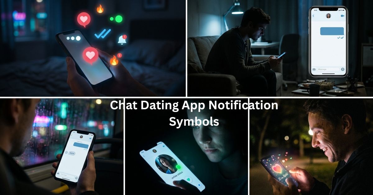
Chat dating app notification symbols — the hearts, the double ticks, the green dots, the typing indicators — are among the most psychologically loaded images in modern life. They carry the weight of every fear about rejection, every hope about connection, every question about where you stand with another person. They do it silently, in microseconds, dozens of times a day.
This guide decodes every major symbol on every major platform, explains why your brain responds to them the way it does, and gives you something most dating app articles never offer: the perspective to engage with these symbols without letting them run your emotional life.
What Are Chat Dating App Notification Symbols?
Chat dating app notification symbols are the visual icons that dating platforms use to communicate activity, status, and emotional signals between users — without requiring any words.
They are a compressed emotional vocabulary. In the span of a glance, they communicate things that used to require a complete conversation: whether your message was received, whether it was read, whether the person is currently available, whether they found you attractive enough to act on.
What makes them different from the notification symbols on a work email or a banking app is their emotional stakes. Nobody feels their chest tighten when they see a push notification about a bill. But when the app tells you someone viewed your profile, or that a match expired before either of you spoke, the response is visceral.
That visceral response is not a glitch in human psychology. It is the human desire for connection — ancient, bone-deep, and completely intact inside the glossy interface of modern dating technology.
The 10 Chat Dating App Notification Symbols — Full Breakdown
| Symbol | Visual | Basic Meaning | Emotional Weight |
| Heart ❤️ | Red or colored heart | Like, match, approval | High — validation and attraction |
| Double Tick ✔✔ | Two checkmarks | Message delivered / seen | Very high — the “seen” anxiety trigger |
| Typing Indicator (…) | Three animated dots | Someone is writing | Extremely high — suspense loop |
| Flame 🔥 | Fire icon | Attraction, streak, “hot” | Medium-high — urgency and intensity |
| Green Dot 🟢 | Small green circle | User is online now | High — opportunity and pressure |
| Profile View 👀 | Eye icon | Someone viewed your profile | High — curiosity and ego activation |
| Match Notification 🎉 | Celebration icon | Mutual interest confirmed | Very high — the peak dopamine moment |
| Super Like ⭐ | Star or special icon | Strong interest signal | High — elevated attention signal |
| Message Bubble 💬 | Chat icon | New message received | Medium — depends on who sent it |
| Unread Badge 🔴 | Red number circle | Unopened notifications | Variable — anticipation or dread |
1. The Heart Icon ❤️ — The Symbol That Started Everything
The heart is humanity’s oldest shorthand for emotional connection, and on dating apps, it performs the same function it has always performed — but faster, more publicly, and with algorithmic amplification.
When someone right swipes or likes your profile, the app signals this with a heart. When the feeling is mutual, it transforms into a match notification — the moment both hearts align. That moment is designed to feel like a win. It is designed to feel like that because it is the moment the app’s engagement model needs you to feel rewarded.
As a chat dating app notification symbol, the heart carries something complex. It signals attraction — but attraction from someone you may know almost nothing about. The brain, however, does not wait for context. Dopamine arrives first, before the assessment does.
The heart notification teaches something important about modern dating: approval feels good even when you are not yet sure you want the approver. That is not shallow. It is biology. But knowing it helps you respond to the symbol with choice rather than reflex.
2. The Double Tick / Read Receipt ✔✔ — The Symbol That Invented New Anxieties
The read receipt is one of the most psychologically consequential inventions of the digital communication era. Two checkmarks that change from grey to blue — and suddenly you know. They saw it. They chose not to respond.

Before read receipts, uncertainty was distributed more evenly. You sent a message. You did not know if they had read it. You could tell yourself they had not seen it yet. The blue tick removed that comfort.
As a chat dating app notification symbol, the read receipt with no response creates a specific kind of distress that psychologists now track: the confirmed-ignore anxiety. The message was message delivered successfully. It was opened. The silence that follows is not ambiguous. It is a choice.
This is why some apps give users the option to disable read receipts — not as a privacy feature but as a mental health one. Some connections need breathing room. Some conversations need the freedom to exist without the watched-clock pressure of timed response.
3. The Typing Indicator (…) — The Symbol of Pure Suspense
Three animated dots. No content. Just: someone is writing.
The typing indicator is the chat dating app notification symbol that most accurately mirrors the experience of waiting for someone to speak in real life — and it is specifically designed to do exactly that. The dots create a loop of anticipation that is almost impossible to break away from. You know something is coming. You do not know what. Your brain’s prediction systems fire continuously, generating possible messages, building and discarding scenarios.

This is not metaphorical suspense. It is the same neurological process that makes mystery novels impossible to put down. The brain cannot tolerate open loops.
What makes the typing indicator particularly powerful — and potentially anxiety-inducing — is how easily it can be misread. The dots appear, then disappear. The person was typing, then stopped. They started again. They deleted everything and started over. Each disappearance is a small rejection. Each reappearance is a renewal of hope. The loop continues.
Many users report that the typing indicator is more emotionally affecting than the actual message that eventually arrives. The waiting is more intense than the arrival.
4. The Flame Icon 🔥 — Speed, Intensity, and the Problem With Both
The flame is one of the more aggressive chat dating app notification symbols in the modern dating lexicon. On Tinder, the flame appears in the brand’s own logo — it signals that this app is where things heat up quickly. Flame icons in various forms appear to indicate profile engagement levels, swipe streaks, and what the algorithm calculates as “hot” profiles in a given area.
The problem with fire as a dating symbol is the same problem with fire generally: it is exciting, it is consuming, and it is not sustainable as a primary energy source.
Apps that use flame imagery are explicitly associating their experience with urgency and intensity over depth and duration. This is not a criticism — it is a design intention worth understanding. When you see flame notifications dominating your feed, you are in an environment optimized for speed over connection. Adjust your expectations accordingly.
5. The Green Dot 🟢 — Online Status and the Pressure It Creates
The online status indicator is a small circle, usually green, that appears near a profile to signal that the person is currently active on the app.
As a chat dating app notification symbol, it creates a specific kind of pressure on both sides of the screen. If you can see that someone is online but has not responded to your message, the confirmed-ignore anxiety from the read receipt is amplified. If you are online and do not respond, you are implicitly acknowledging that you have chosen silence. The green dot removes the plausible deniability of “I just haven’t opened the app.”

Bumble and Hinge have approached this differently than Tinder — with varying levels of online status visibility and different rules about who sees what. Understanding which app shows this symbol — and when — changes how you should interpret silence.
6. The Profile View / Eye Icon 👀 — Attention Without Commitment
The profile view notification tells you someone looked at your profile without taking action. They arrived. They evaluated. They left without swiping.
This is one of the more psychologically interesting of all chat dating app notification symbols because it triggers curiosity and mild rejection simultaneously. Someone found your profile interesting enough to examine — but not interesting enough to engage with. That ambiguity is its own specific feeling.
On apps that reveal who viewed your profile (typically as a premium feature), this symbol functions as a soft hook: you can see who looked, but you need to pay to find out who they were. The symbol’s real function is conversion — turning emotional curiosity into subscription revenue.
The Neuroscience Behind Why These Symbols Control Your Emotions
The people who designed dating app notification systems understood something that casual users often do not: variable reward schedules are more addictive than consistent ones.
If every notification brought a positive outcome, your brain would normalize the response and the excitement would flatten. But notifications that sometimes bring a match, sometimes bring a read receipt with no reply, and sometimes bring nothing at all — that variability is exactly the schedule that produces compulsive checking behavior.
Dopamine is not released when the reward arrives. It is released in anticipation of a possible reward. This is why you feel something when the notification arrives before you even open it — before you know whether it is a match or a missed connection.
The typing indicator takes this further by creating a real-time anticipation loop that never quite resolves until the message arrives. The green dot creates emotional availability signaling that keeps you present and checking. The read receipt closes the uncertainty loop in the least comfortable direction.
Understanding this architecture does not make it less effective — but it does give you something: choice. When you know you are inside a designed reward system, you can decide when to engage and when to put the phone down.
App-by-App Guide — What Each Platform’s Symbols Mean
| Symbol | Tinder | Bumble | Hinge |
| Heart / Like | Gold heart (free) / Super Like ⭐ | Yellow heart / move | Rose (premium) |
| Read receipt | Blue tick (sent/read) | Visible for both | Seen indicator |
| Typing indicator | Animated dots | Animated dots | Animated dots |
| Online status | Green dot (limited) | Recently active label | Active today/recently |
| Match notification | Celebration animation | Same + 24hr timer | “It’s a Match” with comment |
| Profile views | Premium feature | Beeline (premium) | Standouts (premium) |
| Unread badge | Red number | Red number | Red number |
Key differences that matter:
Bumble’s 24-hour timer — After a match, women must message first within 24 hours or the match expires. The timer notification is the most urgency-producing symbol on any major dating platform. It is not subtle. It is designed to force action.
Hinge’s Rose — A rose on Hinge functions similarly to a super like — it signals elevated, specific interest rather than casual swiping. Receiving one carries more weight than a standard like because it is limited and deliberate.
Tinder’s Super Like ⭐ — The super like signals that someone did not just find you swipe-worthy but actively decided to signal elevated interest. It is the equivalent of raising your hand across a crowded room rather than simply making eye contact.

How to Read Chat Dating App Notification Symbols Without Losing Your Mind
Most anxiety around chat dating app notification symbols comes from treating them as more definitive than they are.
A read receipt with no reply is not rejection. It is a person in the middle of their day who opened the app and got distracted, changed their mind, felt uncertain, or simply did not know what to say yet. The silence that follows a read receipt can mean a dozen things. Treating it as conclusive evidence of disinterest is a choice, not a fact.
A few principles that help:
Set your checking window. Decide when you will check the app and when you will not. Continuous checking creates continuous vulnerability to mood shifts driven by notification status. Two or three intentional check-ins per day reduces the symbol’s power over your nervous system without disengaging from connections that matter.
Read patterns, not individual signals. One unanswered message is meaningless data. A pattern of consistent engagement followed by sudden silence is information. One read receipt is an event. Five consecutive read receipts without response is a pattern worth noting.
The green dot is not an obligation. Someone being online does not mean they owe you a response. Availability and responsiveness are different things. The green dot tells you they are present on the app. It does not tell you what they are thinking about.
When Chat Dating App Notification Symbols Become a Mental Health Issue
Ghosting — the practice of abrupt, unexplained silence after a period of engagement — is one of the most psychologically damaging experiences in modern dating, and chat dating app notification symbols make it more visible than it has ever been.
Before read receipts and online status indicators, ghosting was ambiguous. You did not know if the person had seen your messages. The app could have deleted your match without your knowledge. You could maintain uncertainty as a form of protection.
Modern notification systems remove that protection. When you can see that someone has been online seventeen times since your last message and has not responded, the information is clear. The harm of ghosting is amplified by the visibility of the silence.
Breadcrumbing — the practice of occasional, low-effort engagement designed to maintain interest without genuine commitment — is also made more legible by notifications. Sporadic likes, occasional message bubbles that result in nothing, profile views with no follow-up: these are the notification signatures of someone who wants to stay on your radar without investing in actual connection.
Over-reliance on chat dating app notification symbols as emotional regulation — checking the app for a mood lift, feeling disproportionately deflated when notifications fail to arrive — is worth taking seriously. If the presence or absence of a small icon on a phone screen is regularly determining whether your day feels good or bad, the relationship with the technology has inverted. The tool should serve the goal. When the tool becomes the emotional source itself, it is time to recalibrate.
Conclusion
A tiny icon on a screen is not supposed to have this much power. And yet here we are — checking the app, watching for the dots, noting who is online, calculating what the blue tick means.
The reason chat dating app notification symbols feel so significant is not that we are naive or addicted. It is that we are human. We are wired to pay attention to signals from other people. We have always been. The technology did not create that need. It simply gave it a new interface.
The most useful thing you can do with the information in this article is not to become immune to these symbols — that is neither possible nor desirable. Connection requires vulnerability to the signals other people send.

Muhammad Shoaib is a passionate content writer and symbolism researcher at TrendyMegzine.com, where he explores the hidden meanings behind symbols, spiritual signs, ancient traditions, dream interpretations, and cultural symbolism.